 InkCraft
Tattoo Fonts: Lettering Styles That Stay Legible
22 original lettering designs drawn for InkCraftBy Uladzimir TumanauUpdated
The same word set in blackletter, typewriter type and copperplate is three different tattoos, and the three do not age at the same rate. Open counters, generous spacing and letters about a centimetre tall are what keep lettering readable once the ink has spread.
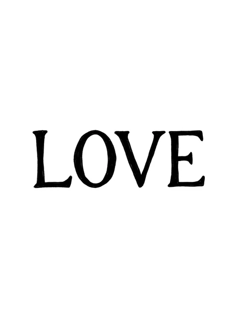
Black and grey lettering lettering tattoo design Try it on — Black and grey lettering lettering tattoo design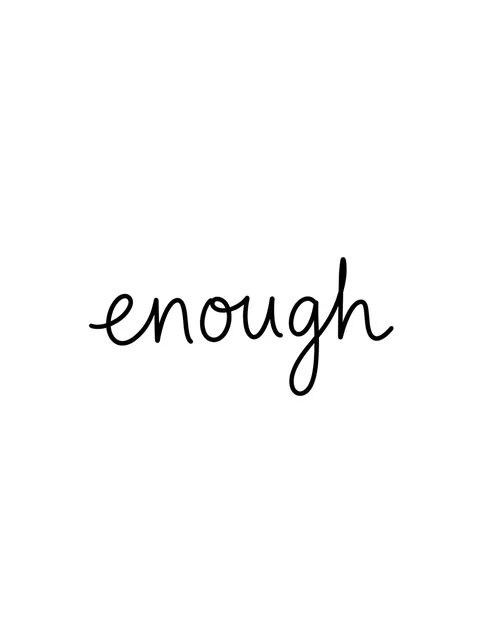
Black and grey lettering lettering tattoo design Try it on — Black and grey lettering lettering tattoo design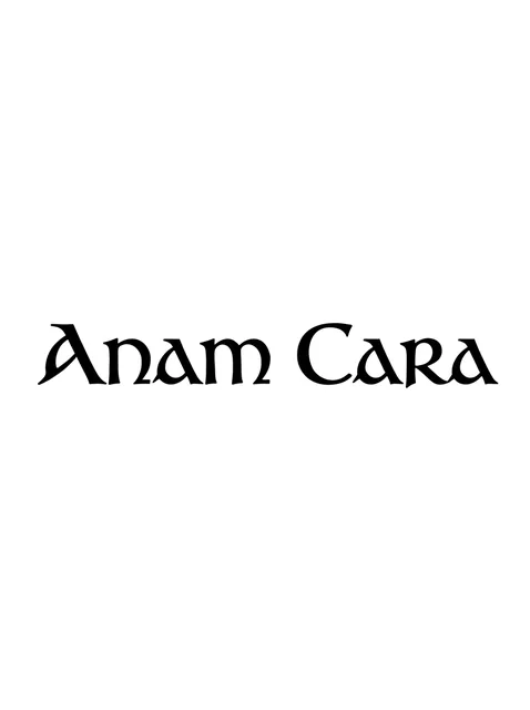
Black and grey lettering lettering tattoo design Try it on — Black and grey lettering lettering tattoo design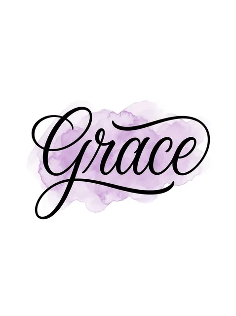
Color lettering lettering tattoo design: a long swash from the G and a looping tail under the word Try it on — Color lettering lettering tattoo design: a long swash from the G and a looping tail under the word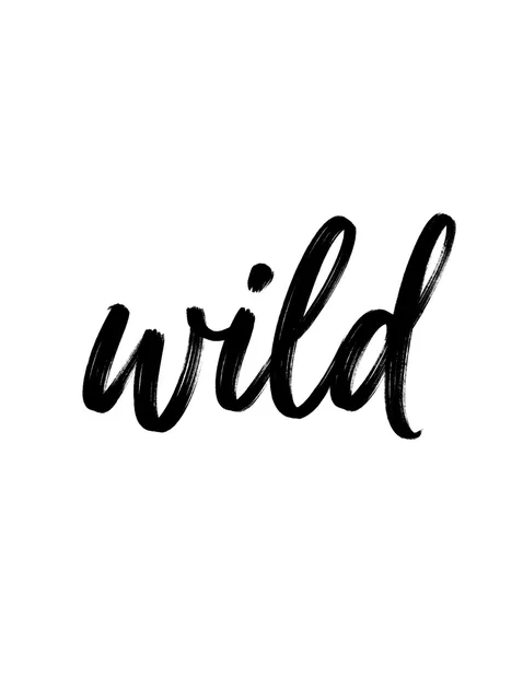
Black and grey lettering lettering tattoo design Try it on — Black and grey lettering lettering tattoo design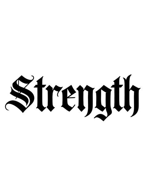
Black and grey lettering lettering tattoo design Try it on — Black and grey lettering lettering tattoo design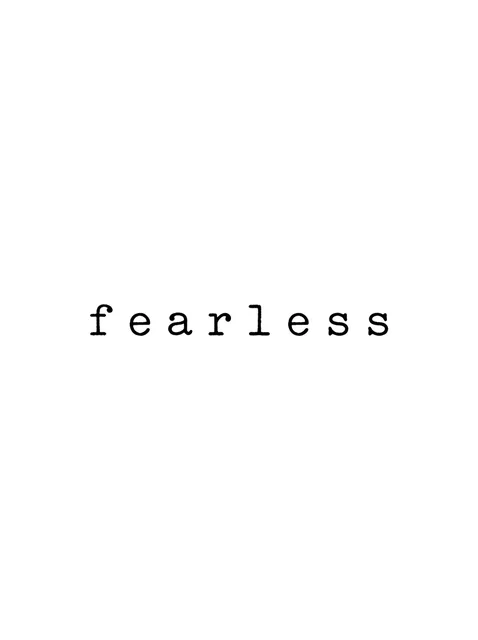
Black and grey lettering lettering tattoo design Try it on — Black and grey lettering lettering tattoo design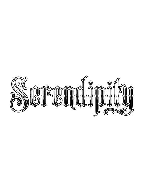
Black and grey lettering lettering tattoo design: a scroll flourish under the final y Try it on — Black and grey lettering lettering tattoo design: a scroll flourish under the final y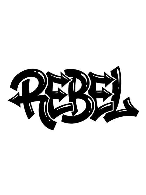
Black and grey lettering lettering tattoo design Try it on — Black and grey lettering lettering tattoo design
Black and grey lettering lettering tattoo design Try it on — Black and grey lettering lettering tattoo design
Black and grey lettering lettering tattoo design Try it on — Black and grey lettering lettering tattoo design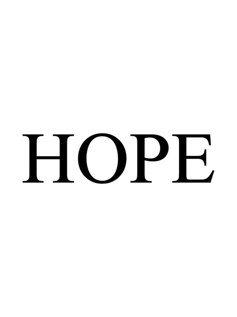
Black and grey lettering lettering tattoo design Try it on — Black and grey lettering lettering tattoo design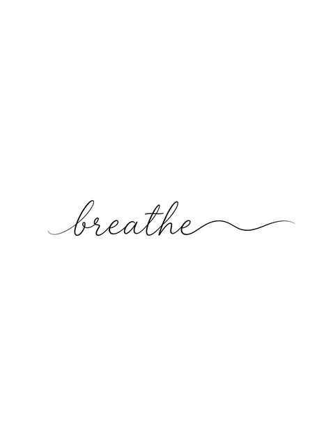
Black and grey lettering lettering tattoo design Try it on — Black and grey lettering lettering tattoo design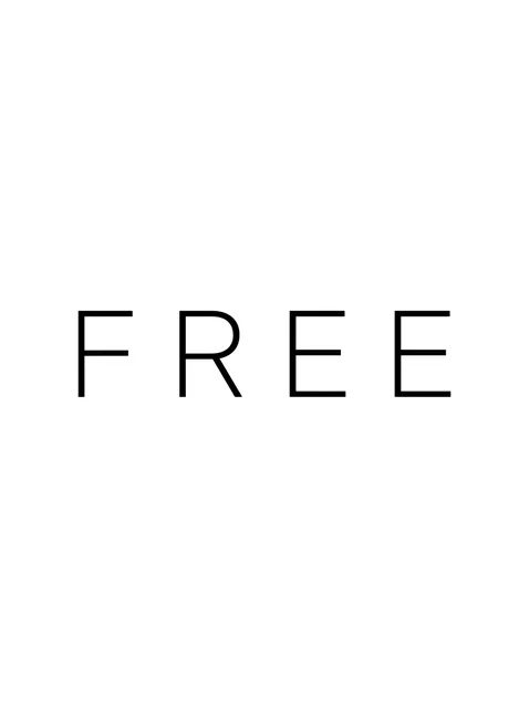
Black and grey lettering lettering tattoo design Try it on — Black and grey lettering lettering tattoo design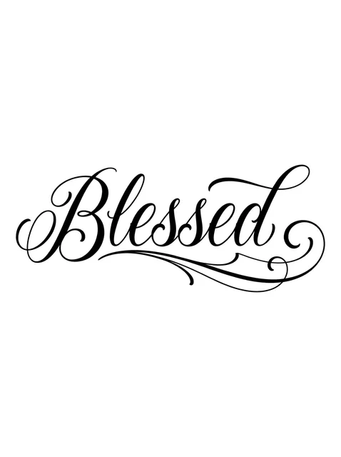
Black and grey lettering lettering tattoo design Try it on — Black and grey lettering lettering tattoo design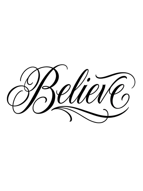
Black and grey lettering lettering tattoo design Try it on — Black and grey lettering lettering tattoo design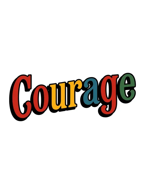
Color lettering lettering tattoo design Try it on — Color lettering lettering tattoo design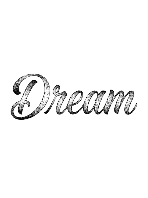
Black and grey lettering lettering tattoo design Try it on — Black and grey lettering lettering tattoo design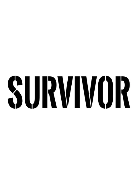
Black and grey lettering lettering tattoo design Try it on — Black and grey lettering lettering tattoo design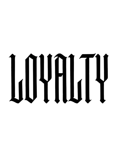
Black and grey lettering lettering tattoo design Try it on — Black and grey lettering lettering tattoo design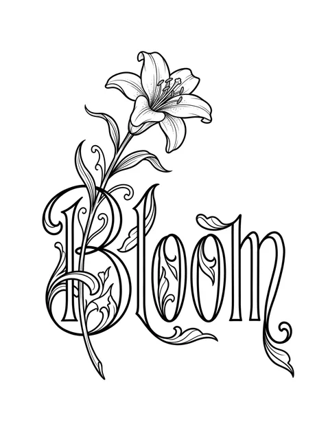
Black and grey lettering lettering and lily tattoo design Try it on — Black and grey lettering lettering and lily tattoo design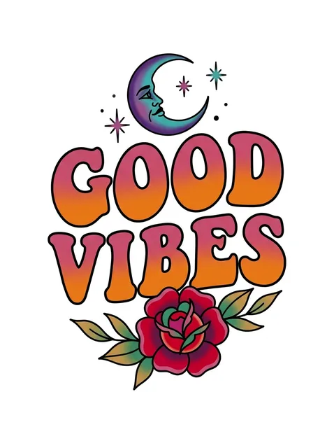
Color lettering lettering and moon tattoo design Try it on — Color lettering lettering and moon tattoo design


Tap any design to see it on your own skin in the try-on — no signup.
This set of 22 lettering designs, by the numbers
- Styles represented
- lettering (22)
- Black-and-grey vs colour
- 86% black-and-grey, 14% colour
- Most often drawn with
- lily, moon, rose
Counted from the 22 designs shown on this page. Every one was drawn for InkCraft — none are scraped or reposted. Free to reference with a link to this page.
What a lettering tattoo means
Choosing a typeface is choosing a tone of voice before anyone has read the word. Strength in heavy blackletter sounds like a charter or a newspaper masthead; the same word in small lower-case typewriter type sounds like a note left for yourself; in sign-painter capitals with a drop shadow it sounds like a shop front. Most people pick the word first and the letterform second, and are then surprised by how much the second decision changes the first.
Words are chosen over pictures for their exactness. A rose can mean love, grief or nothing in particular, and people read it however they like; HOPE means hope. That literalness is the whole appeal for someone who wants no room for misreading, and it is also the cost, because a word has no second reading to retreat into on the days it feels too plain.
Most letterforms arrive with a borrowed setting, and the setting is part of what they say. Blackletter carries churches, diplomas, the Chicano lettering of Los Angeles and the logos of heavy metal bands. Uncial carries Ireland, which is why Anam Cara, Irish for soul friend, is set in it here. Stencil capitals carry military crates and survival; typewriter type carries letters, diaries and the act of writing; fat interlocking graffiti capitals carry the New York subway cars on which that style was worked out.
Everyday handwriting is the one letterform chosen for its lack of design. The small, slightly uneven enough and breathe on this page are meant to look unperformed, as if written in passing, and they are harder to draw than they look: an artist who smooths every wobble out of them turns them back into a font.
Colour and ornament shift the register again. GOOD VIBES in rounded 1970s capitals shaded from pink to orange, or Courage in flat red, yellow, blue and green behind a black drop shadow, is decorative before it is verbal. Lettering like that is seen as a picture first and read as a word second, which suits a cheerful word and undercuts a serious one.
Where the design comes from
Nearly every letterform used in tattooing is older than Western tattooing itself. Roman capitals descend from inscriptions such as the one on the base of Trajan's Column, cut in Rome in 113, which Carol Twombly redrew as the Trajan typeface for Adobe in 1989. Uncial is a late Roman book hand that Irish scribes took up and adapted; the Book of Kells, made around 800, is written in its insular descendant. Blackletter is the letter Gutenberg cast for his Bible in the 1450s, and much German printing stayed in it until 1941, when a decree issued by Martin Bormann ordered it replaced. Copperplate comes from eighteenth-century English writing masters, typewriter type from office machines (Howard Kettler drew Courier for IBM in 1955) and stencil capitals from shipping and the army. For most of the twentieth century tattooists lettered all of them by hand, which is why old tattoo lettering has a family likeness that no digital font reproduces.
Choosing yours
- The part of a letter that fails first is the hole in it. The enclosed space inside an a, e or o is called the counter, and it is where spreading ink goes, so faces with small, tight counters (blackletter, condensed gothic capitals, heavy brush strokes) close up first, while open round faces such as Roman serif, clean sans and typewriter type keep their shape longest.
- Size to the smallest letter, not to the word. A reasonable floor is about 5 mm for the lower-case letters of a plain sans or typewriter face, and nearer a centimetre for blackletter, script and engraved letters, whose strokes are heavy relative to the gaps between them. Below that the word still reads on the day and drifts towards a grey bar over the following years.
- Blackletter has a reading problem of its own. Its i, m, n and u are all built from the same short upright stroke, so a word full of them turns into a picket fence; medieval scribes added the dot over the i for exactly that reason. Words such as Strength and LOYALTY suit it, and a word like minimum or unanimous does not.
- Letter spacing is the last decision and the one most often skipped. Letters that nearly touch on the stencil will touch in ten years, so spacing that looks slightly generous on paper is usually right on skin, and the wide tracking of the FREE on this page is as much a practical choice as a fashionable one.
Size, cost and placement
How big, and what it costs
A single word is usually a short sitting, and the letterform moves the price more than the number of letters does. Sans, typewriter and handwriting are quick because each stroke is one pass; blackletter, chicano capitals and engraved Victorian letters take longer because every stroke is filled or shaded, and a watercolour wash or a coloured fill with a drop shadow adds a good deal more. At about a centimetre tall a word runs to roughly a centimetre per letter in a regular-width face, so Serendipity is a forearm piece rather than a wrist one.
Where it sits, and how much it hurts
A word wants a field longer than it is wide: the inner forearm, along the collarbone, the side of the ribs or across the upper back. Tall condensed capitals such as LOYALTY and SURVIVOR can also run vertically down the spine or the outer forearm. Fingers, the sides of the hand and the top of the foot blur lettering soonest, because the skin there is thin, flexes all day and is always rubbing against something. Pain is mild on the forearm and outer arm and sharp over the ribs, collarbone and spine.
What to ask your artist
- Whether the letterform you chose holds at the size you want, or needs more height or a more open face.
- Whether they will redraw a digital font, opening counters, thickening hairlines and loosening the spacing, rather than print it as supplied.
- To print the word at its real size before the stencil goes on, so you can read it from across the room.
Prices vary widely by city and artist — treat these as session lengths rather than quotes, and expect a shop minimum on anything small. The cost guide turns hours into money by size, placement and style.
Common questions
Which tattoo fonts stay readable longest?
Open, even-weight faces: clean sans-serif, Roman serif capitals and typewriter type, because their counters are large and their strokes are all one thickness. Heavy blackletter, condensed gothic capitals and fine copperplate need more size to last, since their gaps are small or their hairlines are thin.
How small can tattoo lettering go?
Plain lower case holds from about 5 mm tall; script, blackletter and engraved letters want nearer a centimetre. Smaller than that, the letters look crisp when fresh and then run together once the ink has spread.
Is Old English the same as blackletter?
Old English is a typefounders' trade name for one kind of blackletter, the upright textura style. It has nothing to do with the Old English language, which was written in a rounded insular script long before blackletter existed.
Can I bring a font from my computer?
Yes, and expect it to be redrawn. A typeface made for paper or a screen has hairlines finer than a needle holds and spacing set for print, so a good artist thickens the thin strokes, opens the counters and loosens the letters before it becomes a stencil.
Does the font change what a word means?
It changes how the word sounds. Blackletter reads as formal and weighty, typewriter as private, sign-painter capitals as loud and cheerful, handwriting as personal. Printing the word in two or three faces at its real size and comparing them side by side is the quickest way to choose.
See it on your skin before you commit
InkCraft places any of these designs on a photo of you — scaled, wrapped and shaded to the placement you pick.