 InkCraft
Tattoo lettering: names, dates, quotes and script
48 original lettering tattoos designs drawn for InkCraftBy Uladzimir TumanauUpdated
Lettering is the one tattoo every viewer can proofread, because everyone knows what each letter should look like. Names, dates, numbers, quotes and memorial lines each have their own page here; what they share is spacing, letter height and a baseline fitted to the body.
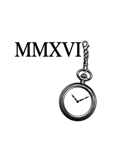
Black and grey lettering roman numerals and clock tattoo design Try it on — Black and grey lettering roman numerals and clock tattoo design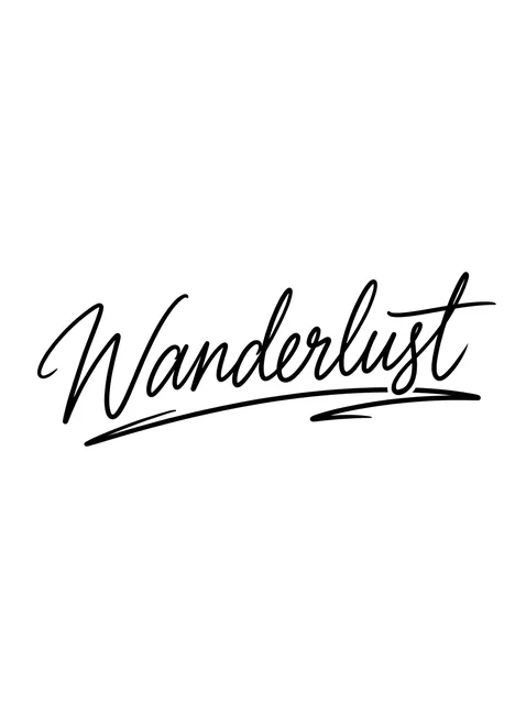
Black and grey lettering lettering tattoo design Try it on — Black and grey lettering lettering tattoo design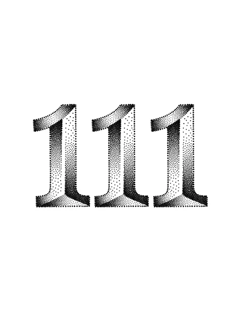
Black and grey lettering number tattoo design Try it on — Black and grey lettering number tattoo design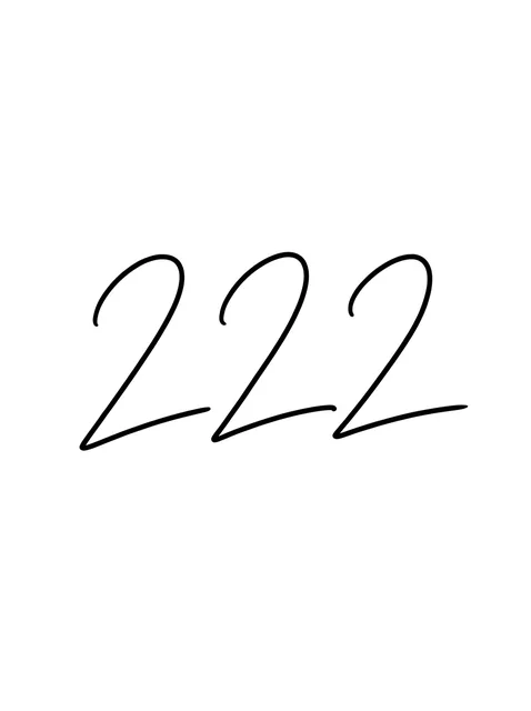
Black and grey lettering number tattoo design Try it on — Black and grey lettering number tattoo design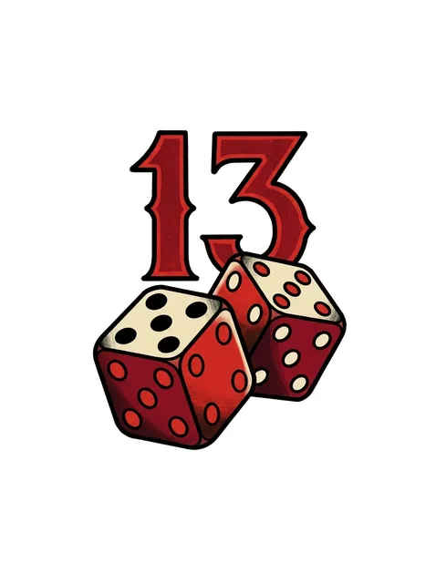
Color lettering number tattoo design Try it on — Color lettering number tattoo design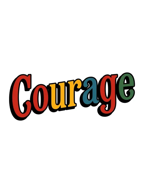
Color lettering lettering tattoo design Try it on — Color lettering lettering tattoo design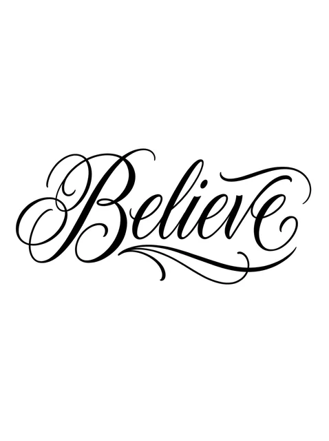
Black and grey lettering lettering tattoo design Try it on — Black and grey lettering lettering tattoo design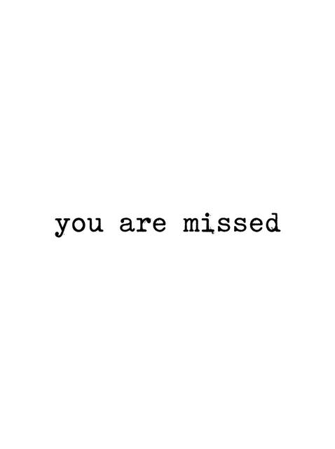
Black and grey lettering rip tattoo design Try it on — Black and grey lettering rip tattoo design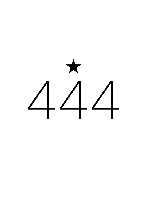
Black and grey lettering number and star tattoo design: a tiny solid black star Try it on — Black and grey lettering number and star tattoo design: a tiny solid black star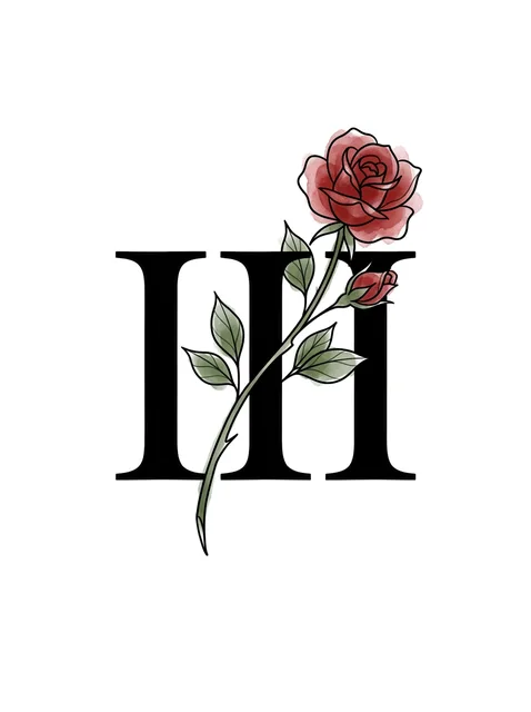
Color lettering roman numerals and rose tattoo design Try it on — Color lettering roman numerals and rose tattoo design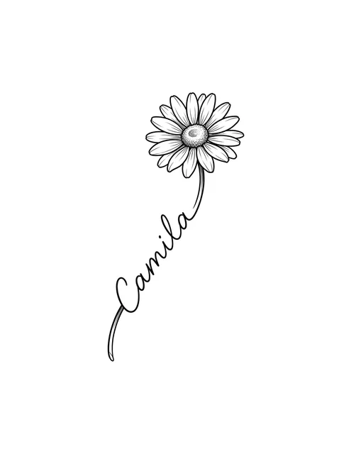
Black and grey lettering name and daisy tattoo design Try it on — Black and grey lettering name and daisy tattoo design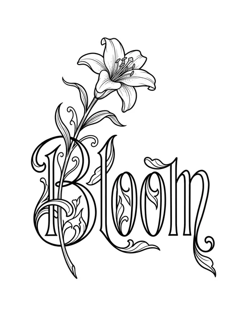
Black and grey lettering lettering and lily tattoo design Try it on — Black and grey lettering lettering and lily tattoo design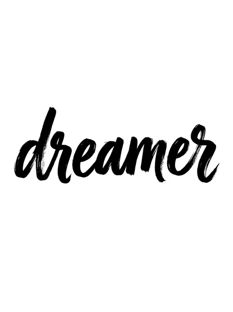
Black and grey lettering script tattoo design: a slight upward slant Try it on — Black and grey lettering script tattoo design: a slight upward slant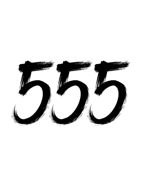
Black and grey lettering number tattoo design Try it on — Black and grey lettering number tattoo design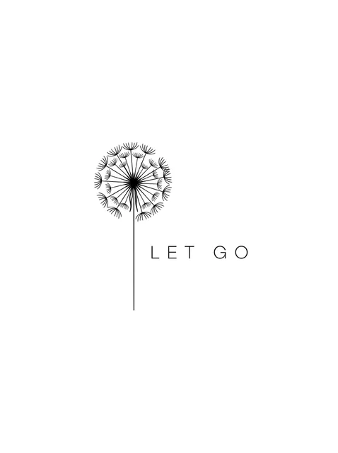
Black and grey lettering quote and dandelion tattoo design: a dandelion seed head Try it on — Black and grey lettering quote and dandelion tattoo design: a dandelion seed head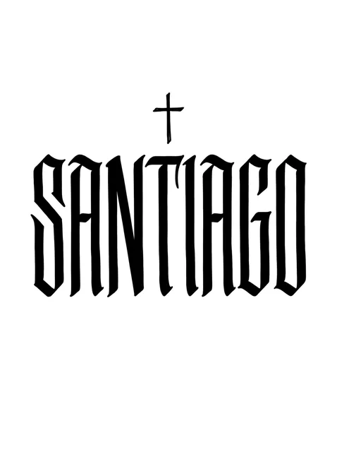
Black and grey lettering name and cross tattoo design Try it on — Black and grey lettering name and cross tattoo design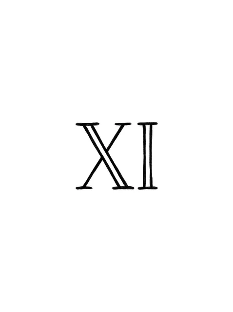
Black and grey lettering roman numerals tattoo design Try it on — Black and grey lettering roman numerals tattoo design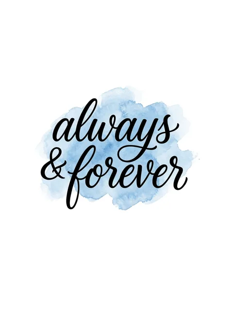
Color lettering rip tattoo design: a blue wash Try it on — Color lettering rip tattoo design: a blue wash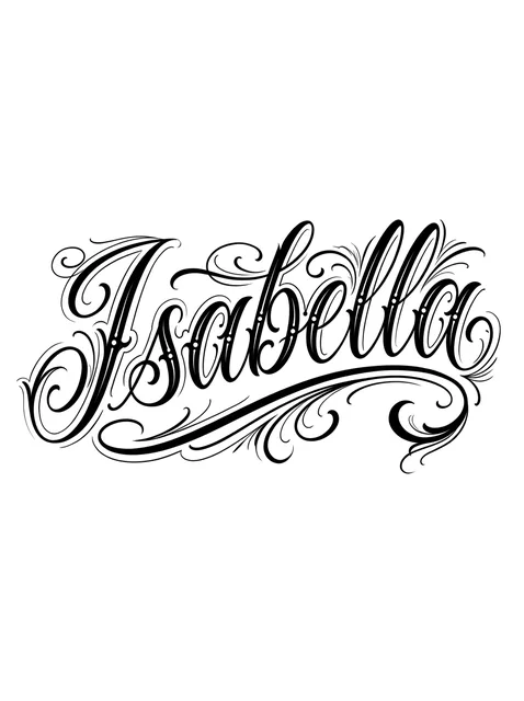
Black and grey lettering name tattoo design Try it on — Black and grey lettering name tattoo design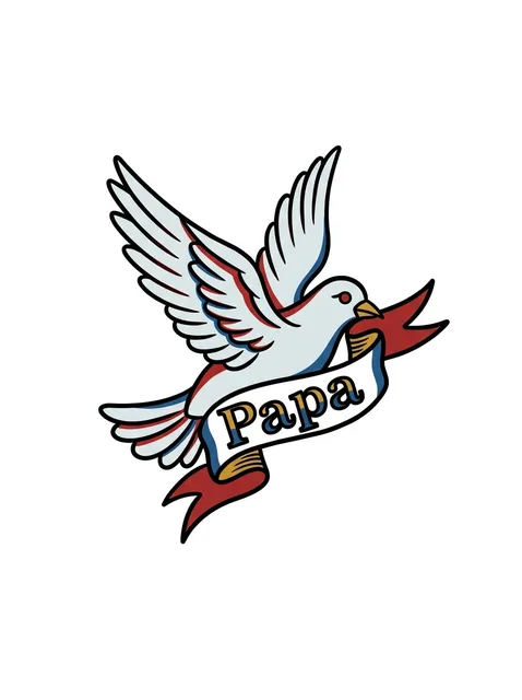
Color lettering rip and bird tattoo design Try it on — Color lettering rip and bird tattoo design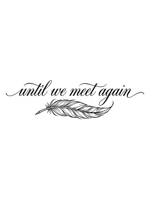
Black and grey lettering rip and feather tattoo design Try it on — Black and grey lettering rip and feather tattoo design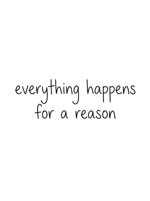
Black and grey lettering quote tattoo design Try it on — Black and grey lettering quote tattoo design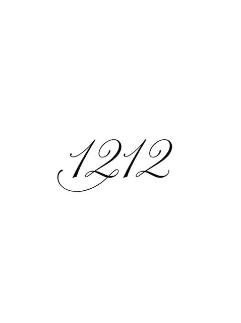
Black and grey lettering number tattoo design Try it on — Black and grey lettering number tattoo design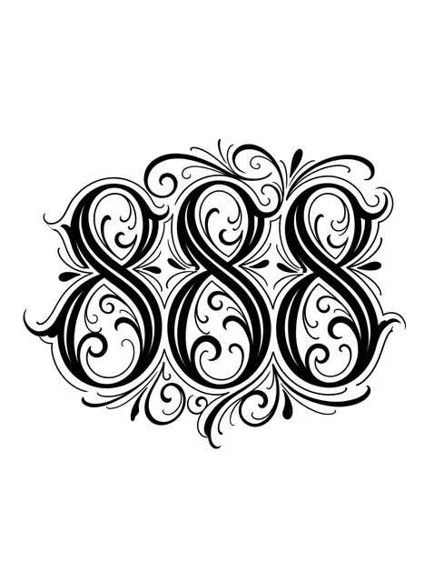
Black and grey lettering number tattoo design Try it on — Black and grey lettering number tattoo design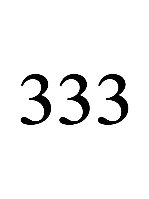
Black and grey lettering number tattoo design Try it on — Black and grey lettering number tattoo design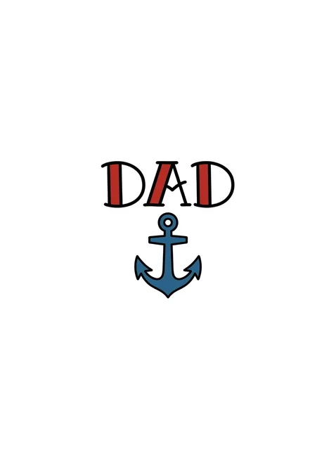
Color lettering name and anchor tattoo design Try it on — Color lettering name and anchor tattoo design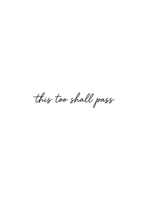
Black and grey lettering quote tattoo design Try it on — Black and grey lettering quote tattoo design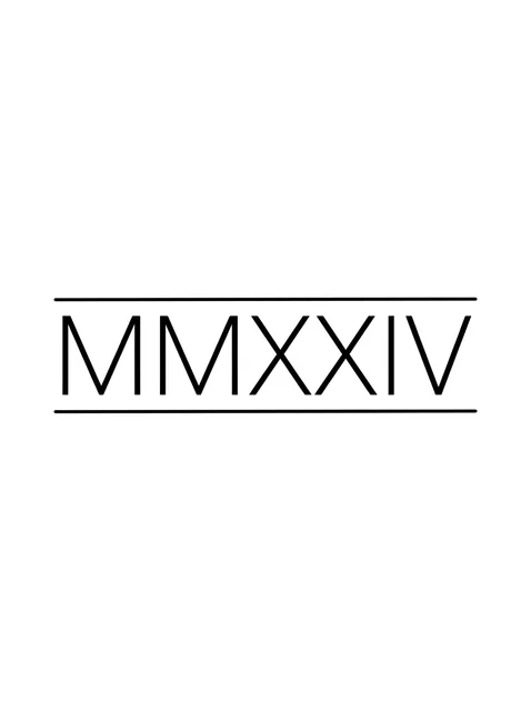
Black and grey lettering roman numerals tattoo design Try it on — Black and grey lettering roman numerals tattoo design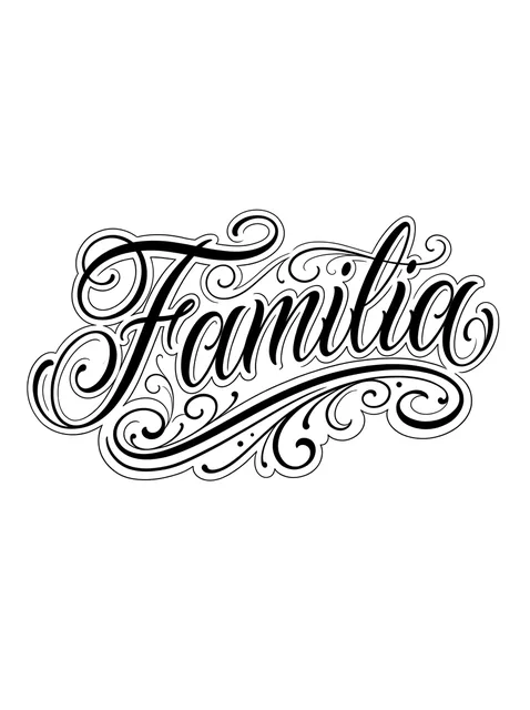
Black and grey lettering lettering tattoo design Try it on — Black and grey lettering lettering tattoo design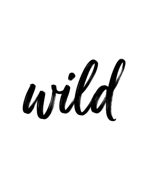
Black and grey lettering lettering tattoo design Try it on — Black and grey lettering lettering tattoo design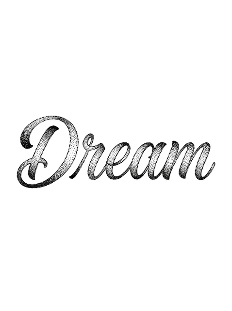
Black and grey lettering lettering tattoo design Try it on — Black and grey lettering lettering tattoo design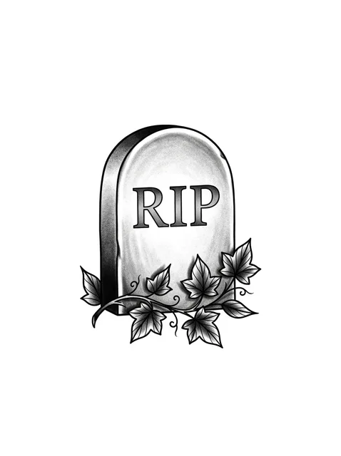
Black and grey lettering rip and vine tattoo design Try it on — Black and grey lettering rip and vine tattoo design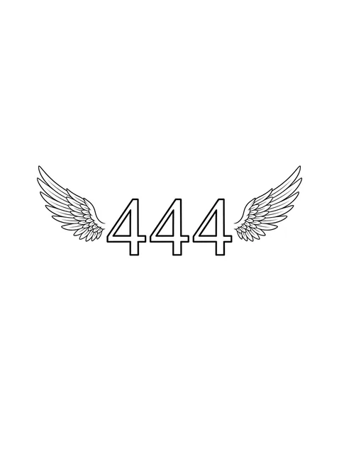
Black and grey lettering number and angel wings tattoo design Try it on — Black and grey lettering number and angel wings tattoo design
Black and grey lettering lettering tattoo design Try it on — Black and grey lettering lettering tattoo design
Black and grey lettering lettering tattoo design Try it on — Black and grey lettering lettering tattoo design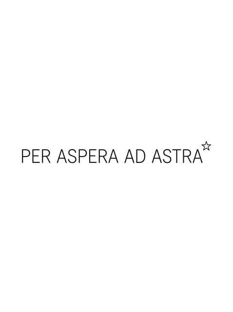
Black and grey lettering quote and star tattoo design Try it on — Black and grey lettering quote and star tattoo design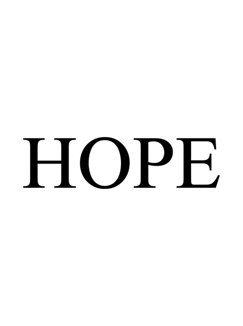
Black and grey lettering lettering tattoo design Try it on — Black and grey lettering lettering tattoo design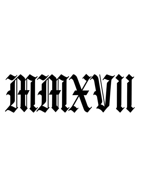
Black and grey lettering roman numerals tattoo design Try it on — Black and grey lettering roman numerals tattoo design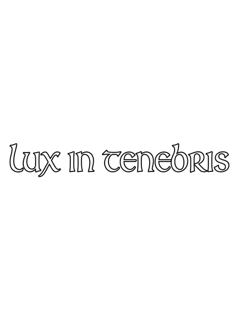
Black and grey lettering quote tattoo design Try it on — Black and grey lettering quote tattoo design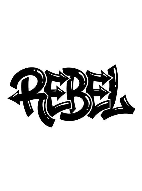
Black and grey lettering lettering tattoo design Try it on — Black and grey lettering lettering tattoo design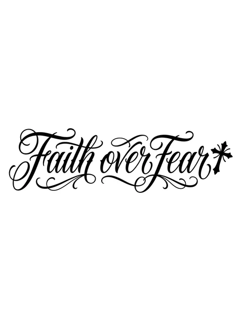
Black and grey lettering quote and cross tattoo design Try it on — Black and grey lettering quote and cross tattoo design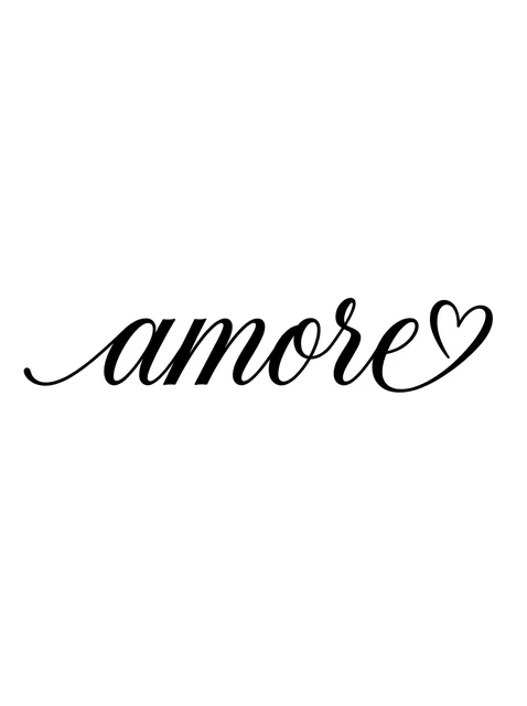
Black and grey lettering script and heart tattoo design Try it on — Black and grey lettering script and heart tattoo design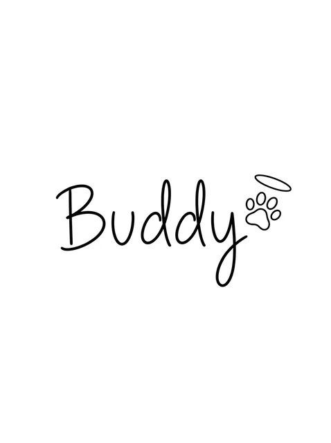
Black and grey lettering rip and paw tattoo design: a halo floating above it Try it on — Black and grey lettering rip and paw tattoo design: a halo floating above it
Black and grey lettering roman numerals and angel wings tattoo design Try it on — Black and grey lettering roman numerals and angel wings tattoo design
Black and grey lettering name and lion tattoo design: a lion's head with a curling mane Try it on — Black and grey lettering name and lion tattoo design: a lion's head with a curling mane
Black and grey lettering name and crown tattoo design: a tall looped M and a small Try it on — Black and grey lettering name and crown tattoo design: a tall looped M and a small
Black and grey lettering script tattoo design Try it on — Black and grey lettering script tattoo design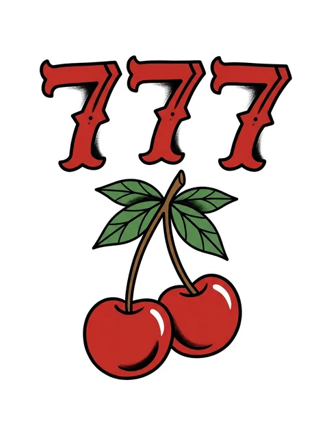
Color lettering number tattoo design Try it on — Color lettering number tattoo design


48 designs drawn for InkCraft in this style. Tap any one to place it on a photo of your own skin.
These 48 designs, in numbers
- Black and grey
- 41
- Colour
- 7
- Subjects covered
- 23
Letters drawn for one word
In the trades that make letters, lettering has a narrow meaning. Calligraphy is written, each letter made in a few strokes of a pen or brush; a typeface is a set of ready-made letters built to fit any word; lettering is drawn, for one word in one place. Tattoo lettering is lettering in that strict sense. Even a word that starts as a font is redrawn for the patch of skin it will occupy, and the redrawing is where the craft lies.
Most of that work is invisible, and it comes from the type designer's bench. Round letters such as O and S are drawn a fraction taller than flat ones such as H and E, because a circle that just touches the baseline looks smaller than a square that does; the extra is called overshoot. Spacing is set by eye, wider between two straight stems than between two rounds, and tightened in awkward pairs such as AV and To, where the shapes leave a gap the eye reads as a hole in the word. A word spaced by measurement looks uneven. A word spaced by eye looks even and is not.
Much of tattooing's lettering shares its habits with the sign trade, whose manuals, the Speedball Textbook among them, have taught letterers since 1915: brush capitals, the drop shadow that lifts a word off its ground, the banner curling round it. The set here runs through most of the family: copperplate, sign-painter capitals filled with flat colour, Old English numerals, chicano script inside a thin outer contour, dry-brush words, typewriter lower case, and tall Art Nouveau capitals with leafy fills of the kind Alphonse Mucha drew for Paris posters in the 1890s.
Seven pages, one for each kind of word
Almost every lettering tattoo is one of seven things, and each has a page with the detail that belongs to it. When the question is which letterform, start with tattoo fonts, which compares blackletter, typewriter, uncial and graffiti capitals by how long they stay readable. When the words should look handwritten and joined, script tattoos covers copperplate, chicano and brush hands and the hairlines that make them fragile.
Three pages are about particular words. Name tattoos deals with children, parents and partners, and with checking a spelling you are sure you know. Quote tattoos covers Latin tags, psalms and proverbs, and how many words a wrist or a collarbone can carry. Memorial lettering covers RIP, In loving memory and the word someone was actually called by.
Two are about figures. Roman numeral tattoos sets out the conversion rules and the day-and-month order that can turn one date into two. Number tattoos covers repeated angel numbers, lucky sevens and defiant thirteens, and why the loops of an 8 or a 9 fill before anything else. Some designs belong to two at once, such as a pet's name beside a paw print, and the grid above draws from all seven.
Setting a word on a body
A word needs a baseline, and on a body the baseline is rarely straight. Across a collarbone or the top of the back, text is usually set on a gentle arc that follows the bone, because a dead-straight line on a curved surface looks bent from every angle but one. Down a forearm or a spine the baseline runs with the limb. Check the stencil standing, arms relaxed and head level, since that is the posture everyone else will read it in.
Letter height decides who the reader is, which is the rule sign makers size a shop front by. Letters a centimetre tall are read by the wearer and by whoever is sitting beside them; to be read across a room a word needs letters several times that height, which is part of why lettering on old flash is big, blocky and shadowed, and why a fine line of script is private whether or not it was meant to be.
When a word shares the piece with a picture, decide which one is read first. In most designs here the word leads and the image answers it: a name that becomes the stem of a daisy, amore whose last letter runs into a small heart, DAD above a flat blue anchor. When the picture leads, the word moves onto a banner with ground of its own, because laid straight across a detailed image it loses. Try the word on a photo at its real height: lettering either reads or it does not, which makes it the easiest tattoo to judge from a mock-up.
What an hour of this work costs, and how many hours lettering tattoos takes at each size, is in the cost guide. How it behaves later — under a laser, and as the thing doing the covering — is in the removal and cover-up guide.
Common questions
- Is lettering a style or a subject?
- Both, which is why the site has a page for each. As a style it is the craft of drawing letters, and this page gathers lettered designs of every kind: names, dates, numbers, quotes and memorial lines. The tattoo fonts page treats it as a subject, the choice of letterform for one word.
- How do I judge an artist's lettering?
- Look at healed work rather than fresh photographs, and read it like a proof. The baseline should stay level, the slant constant, the strokes either one weight or a deliberate contrast, and the gaps between letters should look even. Round letters should look as tall as straight ones. Some artists specialise in lettering, and for anything long it is worth finding one.
- Can lettering be added to a tattoo I already have?
- Often, and it is among the commonest additions: a name in an empty banner, a date under a portrait, a word along the edge of a sleeve. Match the line weight of the healed piece rather than the look of the new letters, which will sit darker and crisper than their neighbours for the first months.
- Should the word sit on a banner or straight on the skin?
- On a banner when a picture is the main subject or the word crosses busy linework, since the banner gives it a ground of its own. Straight on the skin when the word is the whole piece, where a frame only adds bulk and time.
- Can a laser remove just one wrong letter?
- Yes. A laser can treat a single letter or word and leave the rest alone, and fading it over a few sessions is often enough for an artist to redraw the word on top. Clearing it completely takes a full course, and the spot can stay faintly visible in low, sideways light.
See this style on your own skin
InkCraft places a design on a photo of you — scaled, wrapped and shaded to the spot you pick, so you can judge how the style reads on your body before it is permanent.