 InkCraft
Script Tattoo Ideas and Cursive Lettering Styles
22 original script designs drawn for InkCraftBy Uladzimir TumanauUpdated
Joined writing is the most fragile lettering there is, because its whole character lies in the contrast between heavy downstrokes and hairlines. Open loops, loose letter spacing and hairlines laid at a weight the skin can hold are what stop a cursive word closing up.
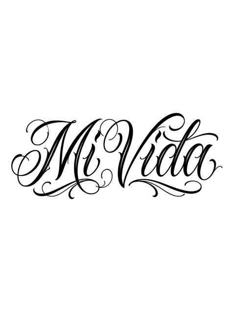
Black and grey lettering script tattoo design Try it on — Black and grey lettering script tattoo design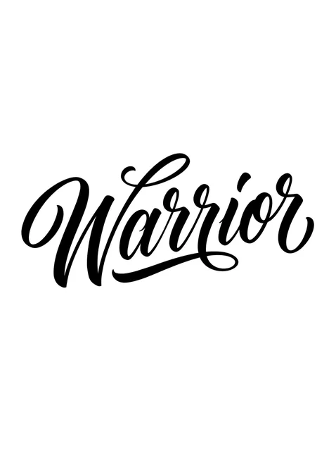
Black and grey lettering script tattoo design Try it on — Black and grey lettering script tattoo design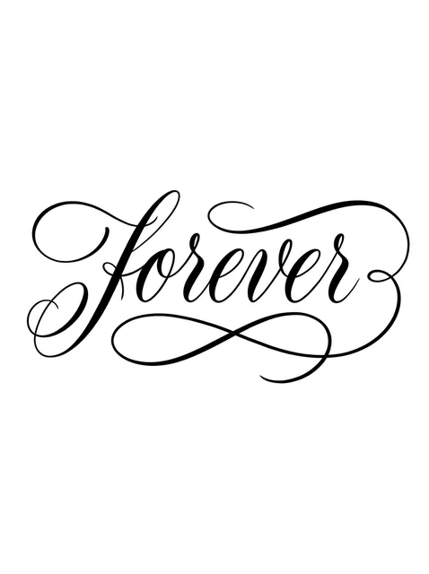
Black and grey lettering script tattoo design Try it on — Black and grey lettering script tattoo design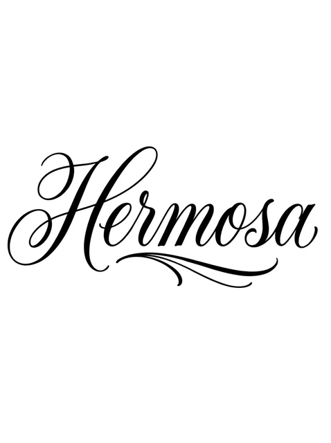
Black and grey lettering script tattoo design Try it on — Black and grey lettering script tattoo design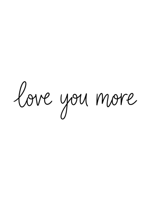
Black and grey lettering script tattoo design Try it on — Black and grey lettering script tattoo design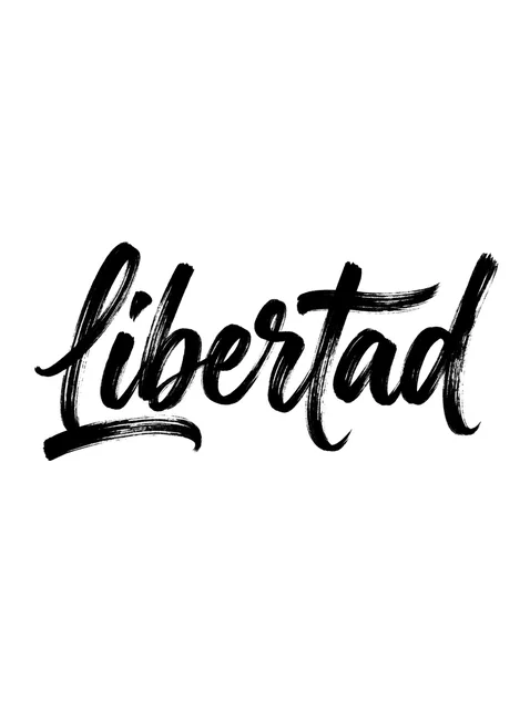
Black and grey lettering script tattoo design Try it on — Black and grey lettering script tattoo design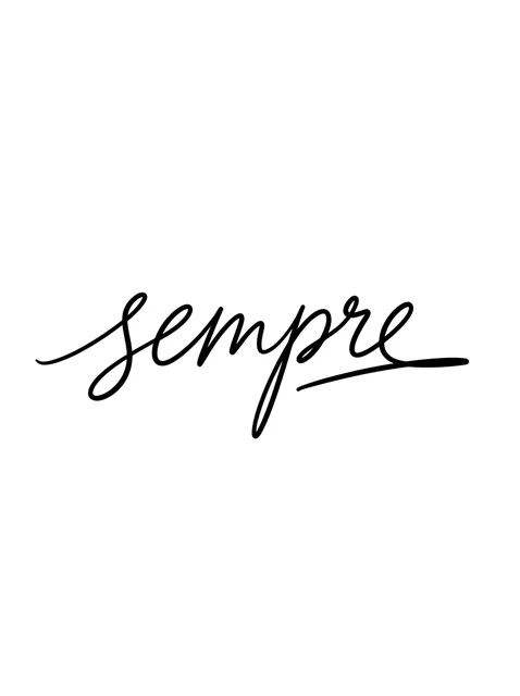
Black and grey lettering script tattoo design Try it on — Black and grey lettering script tattoo design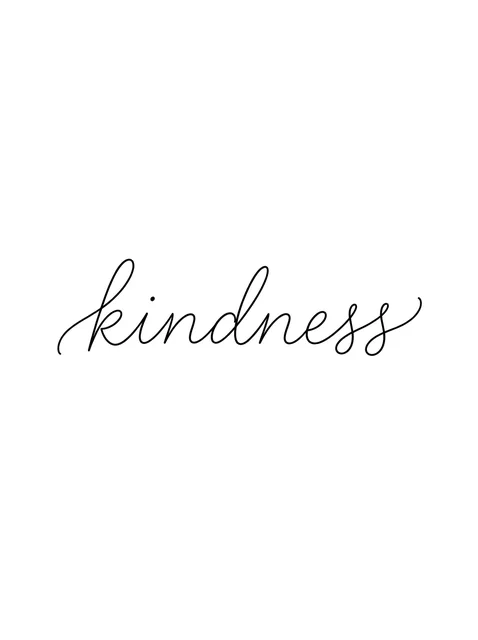
Black and grey lettering script tattoo design: a thin entry stroke and a curled exit stroke Try it on — Black and grey lettering script tattoo design: a thin entry stroke and a curled exit stroke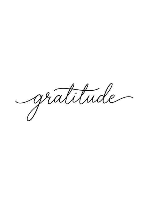
Black and grey lettering script tattoo design Try it on — Black and grey lettering script tattoo design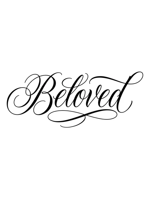
Black and grey lettering script tattoo design Try it on — Black and grey lettering script tattoo design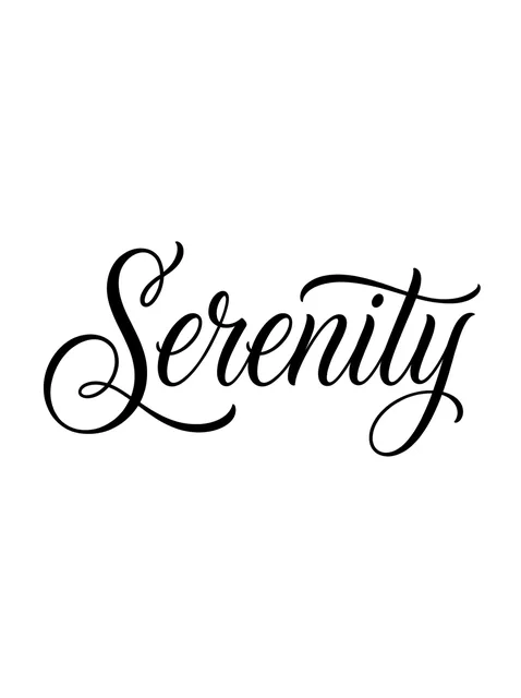
Black and grey lettering script tattoo design Try it on — Black and grey lettering script tattoo design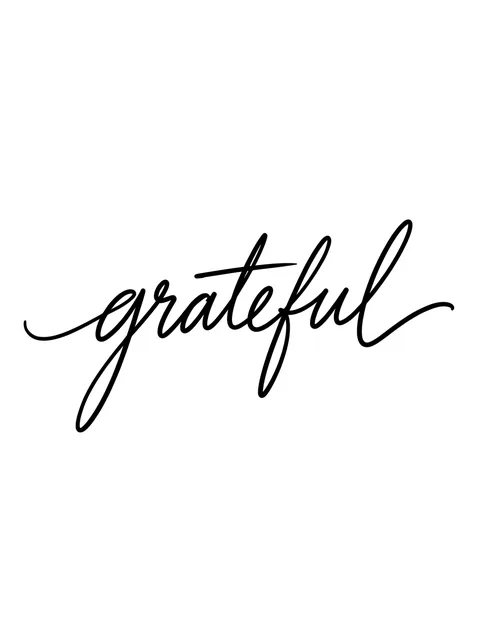
Black and grey lettering script tattoo design Try it on — Black and grey lettering script tattoo design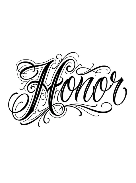
Black and grey lettering script tattoo design Try it on — Black and grey lettering script tattoo design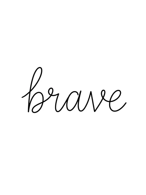
Black and grey lettering script tattoo design Try it on — Black and grey lettering script tattoo design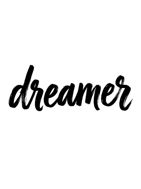
Black and grey lettering script tattoo design: a slight upward slant Try it on — Black and grey lettering script tattoo design: a slight upward slant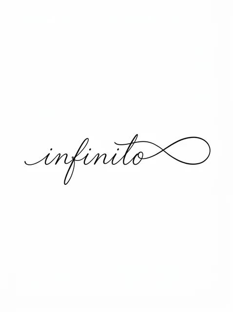
Black and grey lettering script and infinity tattoo design Try it on — Black and grey lettering script and infinity tattoo design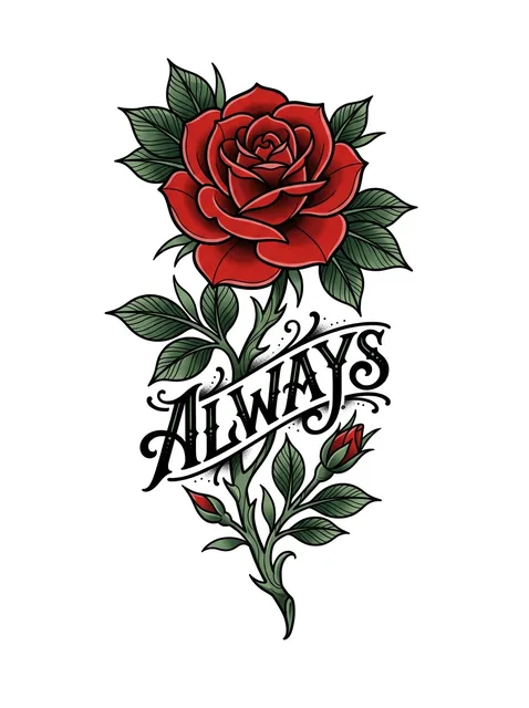
Color lettering script and rose tattoo design Try it on — Color lettering script and rose tattoo design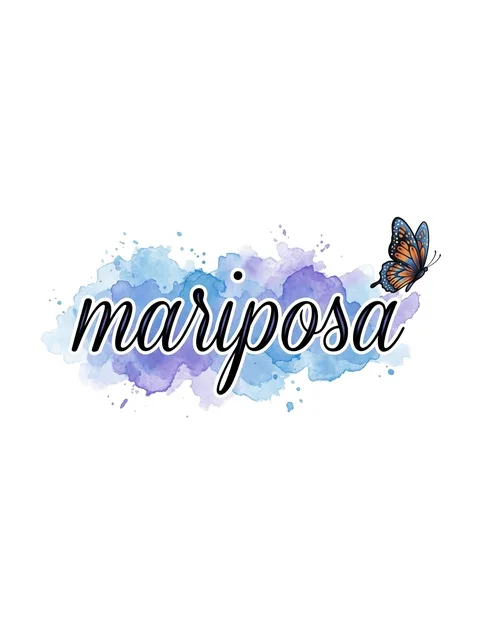
Color lettering script and butterfly tattoo design Try it on — Color lettering script and butterfly tattoo design
Color lettering script and swallow tattoo design Try it on — Color lettering script and swallow tattoo design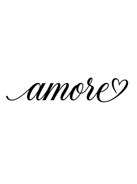
Black and grey lettering script and heart tattoo design Try it on — Black and grey lettering script and heart tattoo design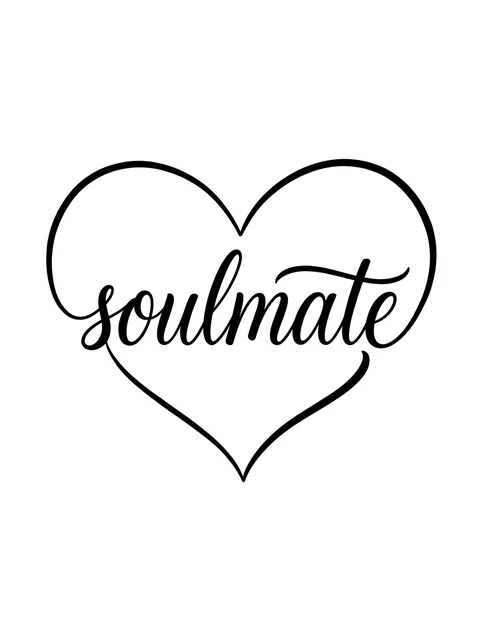
Black and grey lettering script and heart tattoo design: the word curving up to form the heart Try it on — Black and grey lettering script and heart tattoo design: the word curving up to form the heart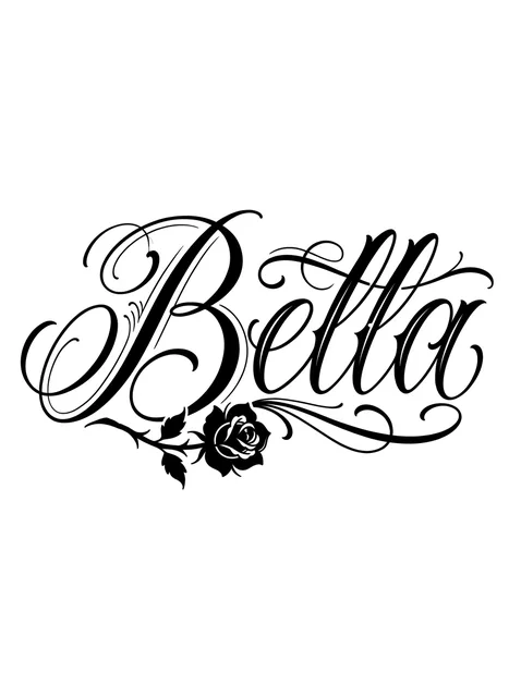
Black and grey lettering script and rose tattoo design Try it on — Black and grey lettering script and rose tattoo design


Tap any design to see it on your own skin in the try-on — no signup.
This set of 22 script designs, by the numbers
- Styles represented
- lettering (22)
- Black-and-grey vs colour
- 86% black-and-grey, 14% colour
- Most often drawn with
- rose, heart, infinity, butterfly
Counted from the 22 designs shown on this page. Every one was drawn for InkCraft — none are scraped or reposted. Free to reference with a link to this page.
What a script tattoo means
Script is chosen because it looks written rather than printed. A word in joined writing reads as something said by one person to another, which is why the words on this page lean so heavily towards affection and devotion: amore, Beloved, soulmate, Hermosa, love you more. Set in capitals the same words would sound like announcements; in cursive they sound addressed.
The second appeal is continuity. A joined word is made in one movement with the pen barely lifting, so script suits words about things that do not break: forever, always, sempre. Several designs here make that literal, letting the last stroke of infinito run on into an infinity loop, or drawing the heart around soulmate out of the entry and exit strokes of the word itself.
Many of the words here are Spanish or Italian (mi vida, mariposa, Libertad, Hermosa, Bella, amore, sempre), and that is not an accident of the drawings. Chicano script grew up around Spanish words and family names, and a Romance-language word in cursive sits inside that tradition. For some wearers it is the family's language; for others a second language keeps a plain sentiment slightly private.
That privacy is real and growing. The Common Core standards adopted across most of the United States from 2010 left cursive out of the curriculum, and although several states have since put it back, a generation of readers finds joined writing slow going and ornate capitals close to unreadable. A script tattoo is partly private by default, which some people want and others only discover afterwards.
Everyday handwriting sits at the plain end of the category. The brave and love you more on this page are thin, slightly uneven joined writing with no flourishes at all, the kind copied from a note, and they express intimacy through the absence of display, where chicano and copperplate express it through ornament. Both are script, and they ask very different things of the artist.
Where the design comes from
Modern script descends from English roundhand, the pointed-pen writing of eighteenth-century clerks that George Bickham engraved for The Universal Penman in the 1730s and 1740s; because its models were printed from engraved copper, the style took the name copperplate. In the United States Platt Rogers Spencer developed a lighter, more ornamental hand in the mid-nineteenth century, and Frank Mason Robinson wrote the Coca-Cola name in Spencerian script in the 1880s. Austin Palmer's plainer method displaced Spencer's in American schools in the early twentieth century. Tattoo script took the flourished capitals of sign painters and then, in 1970s East Los Angeles, the fine single-needle line: Jack Rudy, who worked at Good Time Charlie's Tattooland, is widely credited with shaping the fine-line lettering that grew into what is now called chicano script.
Choosing yours
- Hairlines are where script is won or lost. In pen writing the contrast comes from pressure, thin on the way up and swelling on the way down; on skin the upstroke is a single fine line, and every line spreads by roughly the same small amount over the years. That spread barely registers on a heavy downstroke and transforms a hairline, so the contrast that made the word handsome flattens with age. A hairline laid slightly heavier than the reference keeps more of it, and one laid too fine may heal patchy and break.
- Joined letters sit closer together than printed ones, and the closed shapes go first: the eye of the e, the loops of l and b, the bowls of a and o. As they fill, e reads as an undotted i, rn becomes m and cl becomes d. Ask for the letters to be spaced a little more loosely than looks right on paper and for the loops to be drawn bigger than the reference, which is how a cursive word avoids closing up.
- A blowout is the risk that belongs to fine script. When the needle puts ink below the dermis it spreads sideways into the fat as a blue-grey haze along the line, usually visible within the first weeks, and it shows most on long thin strokes: an exit stroke or a swash under the word betrays it far more than a heavy capital does. Thin skin raises the risk, on the inner wrist, the inner upper arm, the top of the foot and the ribs. A blowout can be hidden by thickening or shadowing the letters, or lightened with a laser.
- Mind the slant. Copperplate leans at about 55 degrees from the baseline and most tattoo script leans with it, so on a limb the word should lean along the length of the arm or leg rather than against it. Set across a wrist, a steep slant can look as if the word is sliding off.
Size, cost and placement
How big, and what it costs
A single script word is normally a short sitting, and the flourishes set the price rather than the letters. Fine single-weight cursive and signature script are quick; copperplate with layered swashes and chicano capitals with filigree take noticeably longer, and a colour ribbon with a swallow or a rose around the word is priced as an illustration that happens to carry text. Script also needs more length than print, since entry and exit strokes add roughly a letter's width at each end.
Where it sits, and how much it hurts
Script likes a long, gently curved field: along the collarbone, down the side of the ribs, the inside of the forearm or down the spine, where the slant and the long exit strokes get the length they need. The inner wrist, inner upper arm and top of the foot give script its best look on the day and its highest blowout risk. The ribs and spine are sharp for pain; the forearm is mild.
What to ask your artist
- What needle the hairlines will be laid with, and at what weight they will heal.
- Whether letter spacing and loop sizes will be opened up from the reference you brought.
- How they handle long exit strokes and swashes on thin skin, where a blowout shows most.
Prices vary widely by city and artist — treat these as session lengths rather than quotes, and expect a shop minimum on anything small. The cost guide turns hours into money by size, placement and style.
Common questions
Why do script tattoos blur more than other lettering?
Because they depend on the thinnest lines and the tightest spaces. Hairlines and loops are the first things spreading ink affects, and joined letters leave less room between them than printed ones. Larger letters, looser spacing and slightly heavier hairlines slow it down a great deal.
What is a blowout in a script tattoo?
Ink placed too deep, below the dermis, which spreads into the fatty layer as a blurred blue-grey halo beside the line. It shows most on long thin strokes and thin skin such as the inner wrist and the top of the foot, and it can be disguised with heavier lettering or shadow, or lightened with a laser.
What letter height does joined script need?
Plan on lower-case letters around a centimetre tall, with capitals and loops rising well above that. Ornate chicano capitals need more, because their filigree is made of hairlines that need room between them to stay separate.
What is the difference between chicano script and copperplate?
Copperplate is a pen hand with regular thick-and-thin contrast and a steady slant. Chicano script uses the same contrast and adds dramatic curling capitals, hairline filigree and deep swashes, often wrapped in a thin outer contour, as on the Honor and Mi Vida pieces here.
Will people be able to read a cursive tattoo?
Not everyone. Cursive dropped out of many American classrooms after 2010, and ornate capitals defeat even practised readers. If you want strangers to read the word, choose a plainer hand such as fine single-weight cursive or handwriting; if you want it kept close, chicano capitals do that on their own.
See it on your skin before you commit
InkCraft places any of these designs on a photo of you — scaled, wrapped and shaded to the placement you pick.