 InkCraft
Gothic tattoos: architecture, not just darkness
29 original gothic tattoos designs drawn for InkCraftBy Uladzimir TumanauUpdated
The word names a period of building before it names a mood, and that is the useful distinction: a gothic tattoo is structural, not simply dark. The pointed arch is the whole of it.
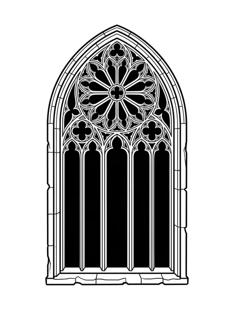
Black and grey gothic rose window tattoo design Try it on — Black and grey gothic rose window tattoo design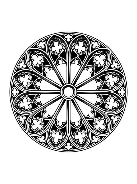
Black and grey gothic rose window and mandala tattoo design Try it on — Black and grey gothic rose window and mandala tattoo design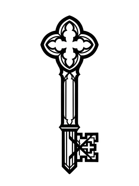
Black and grey gothic key tattoo design Try it on — Black and grey gothic key tattoo design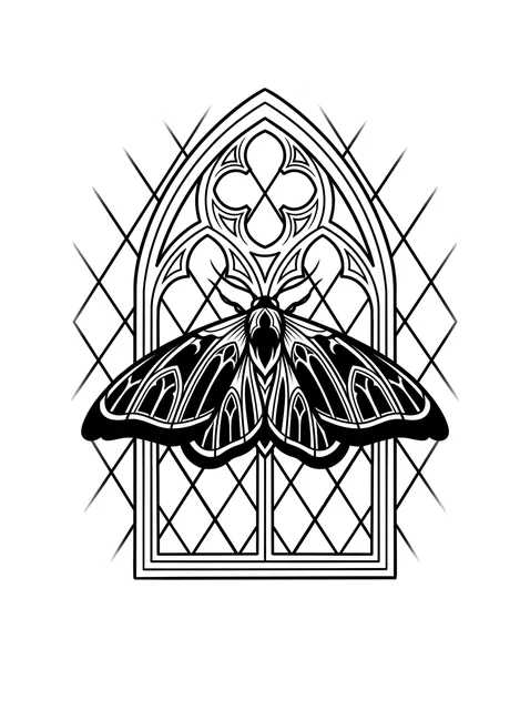
Black and grey gothic moth tattoo design Try it on — Black and grey gothic moth tattoo design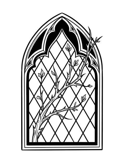
Black and grey gothic tree and leaf tattoo design: a thorny tree branch with delicate leaves Try it on — Black and grey gothic tree and leaf tattoo design: a thorny tree branch with delicate leaves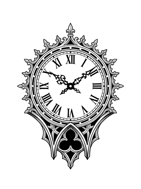
Black and grey gothic clock tattoo design Try it on — Black and grey gothic clock tattoo design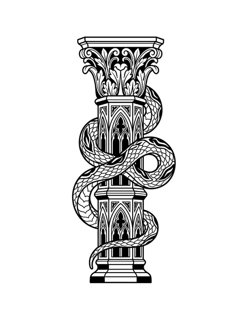
Black and grey gothic snake tattoo design Try it on — Black and grey gothic snake tattoo design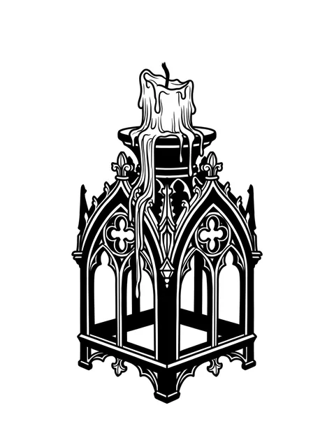
Black and grey gothic candle tattoo design: a melting candle on top Try it on — Black and grey gothic candle tattoo design: a melting candle on top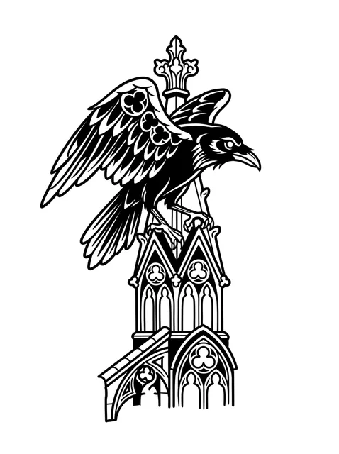
Black and grey gothic raven tattoo design: a raven perched atop an ornate architectural spire Try it on — Black and grey gothic raven tattoo design: a raven perched atop an ornate architectural spire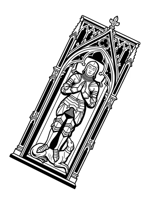
Black and grey gothic knight and praying hands tattoo design Try it on — Black and grey gothic knight and praying hands tattoo design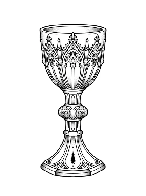
Black and grey gothic chalice tattoo design Try it on — Black and grey gothic chalice tattoo design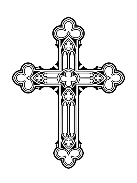
Black and grey gothic cross tattoo design Try it on — Black and grey gothic cross tattoo design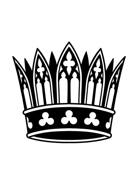
Black and grey gothic crown tattoo design: a gothic-inspired crown Try it on — Black and grey gothic crown tattoo design: a gothic-inspired crown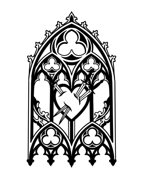
Black and grey gothic rose window and heart tattoo design: a heart pierced by three nails Try it on — Black and grey gothic rose window and heart tattoo design: a heart pierced by three nails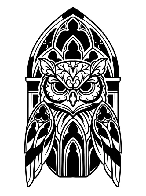
Black and grey gothic owl tattoo design Try it on — Black and grey gothic owl tattoo design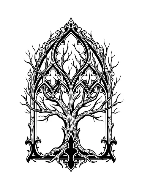
Black and grey gothic tree tattoo design Try it on — Black and grey gothic tree tattoo design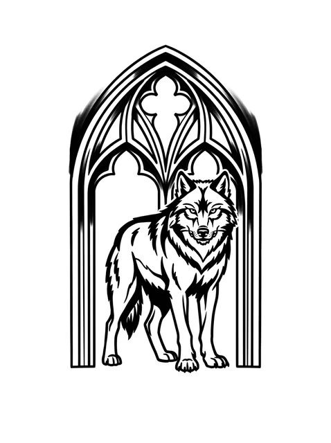
Black and grey gothic wolf tattoo design: a wolf standing within an ornate gothic archway Try it on — Black and grey gothic wolf tattoo design: a wolf standing within an ornate gothic archway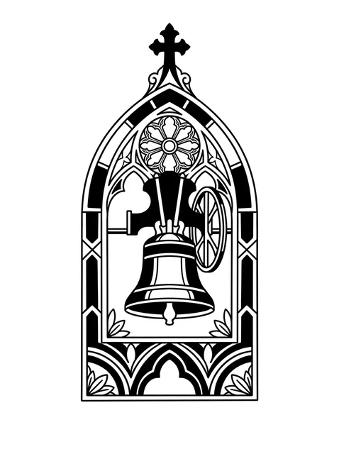
Black and grey gothic cross and rose window tattoo design: the window and the bell are Try it on — Black and grey gothic cross and rose window tattoo design: the window and the bell are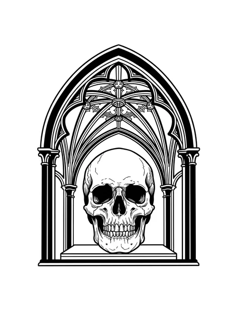
Black and grey gothic skull tattoo design Try it on — Black and grey gothic skull tattoo design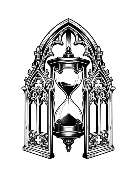
Black and grey gothic hourglass tattoo design: a cathedral window, with detailed arches and tracery Try it on — Black and grey gothic hourglass tattoo design: a cathedral window, with detailed arches and tracery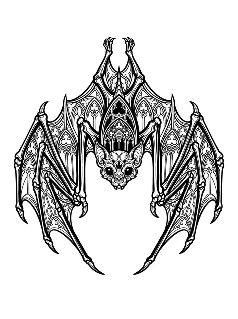
Black and grey gothic bat tattoo design Try it on — Black and grey gothic bat tattoo design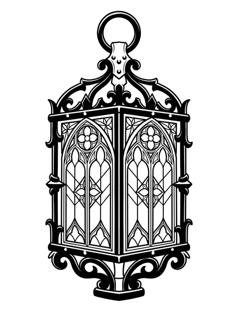
Black and grey gothic lantern tattoo design Try it on — Black and grey gothic lantern tattoo design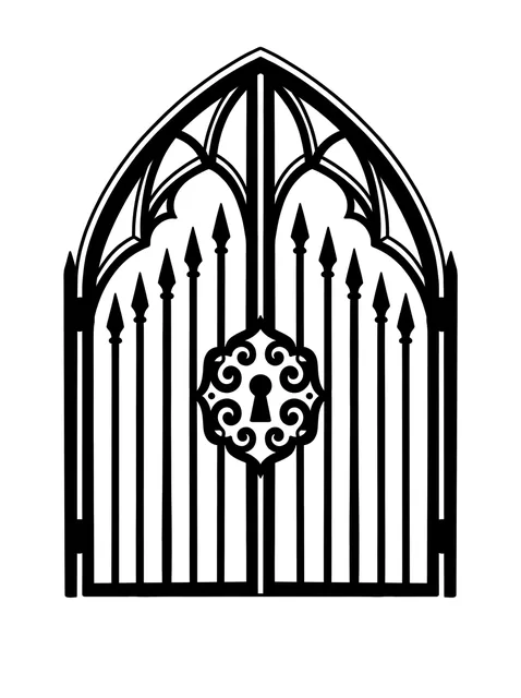
Black and grey gothic key tattoo design: a prominent keyhole in the center Try it on — Black and grey gothic key tattoo design: a prominent keyhole in the center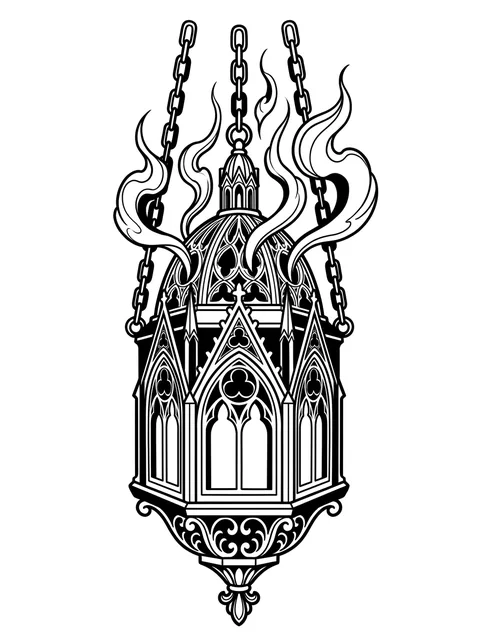
Black and grey gothic lantern tattoo design: a gothic censer or lantern, suspended by chains Try it on — Black and grey gothic lantern tattoo design: a gothic censer or lantern, suspended by chains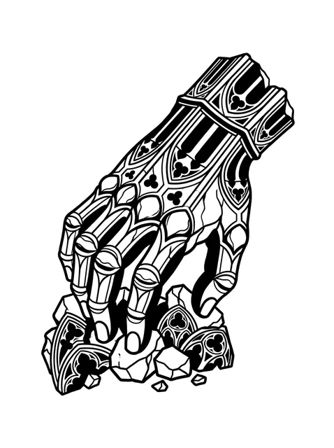
Black and grey gothic skeleton hand and hand tattoo design Try it on — Black and grey gothic skeleton hand and hand tattoo design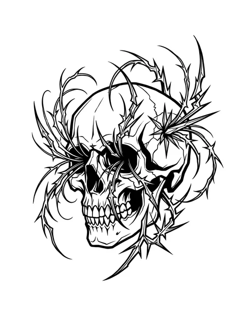
Black and grey gothic skull and vine tattoo design: a skull entangled with thorny vines Try it on — Black and grey gothic skull and vine tattoo design: a skull entangled with thorny vines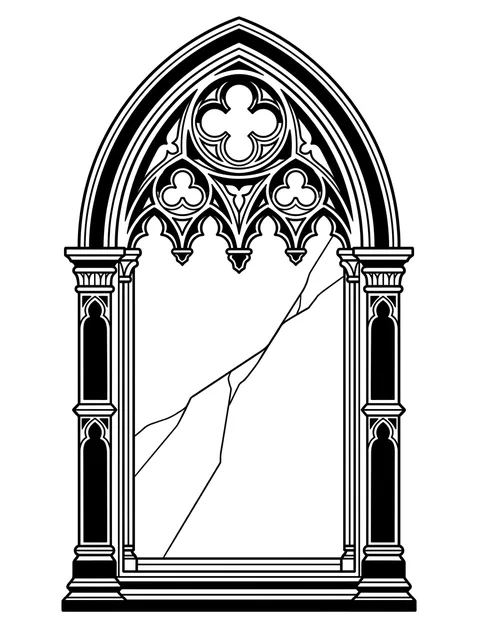
Black and grey gothic rose window tattoo design: a cracked pane suggesting age or decay Try it on — Black and grey gothic rose window tattoo design: a cracked pane suggesting age or decay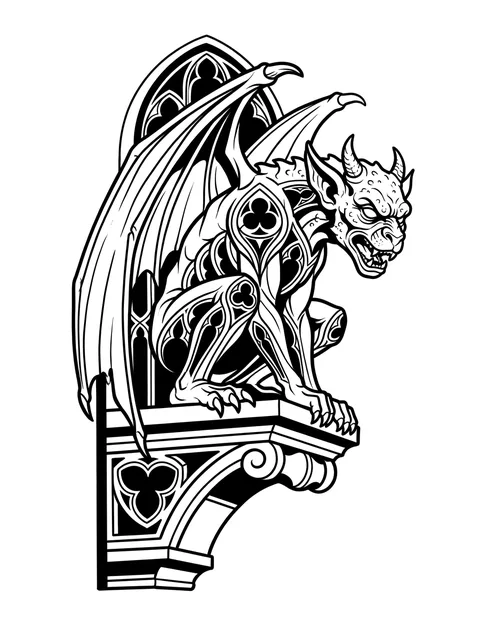
Black and grey gothic demon and dragon tattoo design Try it on — Black and grey gothic demon and dragon tattoo design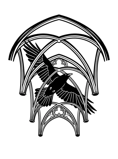
Black and grey gothic raven tattoo design: a raven in flight Try it on — Black and grey gothic raven tattoo design: a raven in flight


29 designs drawn for InkCraft in this style. Tap any one to place it on a photo of your own skin.
These 29 designs, in numbers
- Black and grey
- 29
- Colour
- 0
- Subjects covered
- 28
One shape does all the work
Gothic architecture solved a specific engineering problem. A round Romanesque arch pushes its weight outward, which limits how tall a wall can be; a pointed arch directs more of that thrust downward, so the walls could go higher and thinner and the windows could get enormous. Everything people recognise as gothic follows from that: the height, the glass, the ribbed vaults, the flying buttresses holding the whole thing up from outside.
For a tattoo, it means the style has a shape you can actually use. Put almost any subject inside a pointed arch and it reads gothic — a skull, an owl, a wolf, a bell. Put the same subject in a rectangle and it reads as a picture. That one substitution is the most efficient move available in the whole style and it costs nothing.
It also gives you the ornament vocabulary for free: the trefoil and the quatrefoil, the crocket climbing a spire, the tracery dividing a window. These are real named components rather than invented decoration, which is why a piece using them correctly looks researched and a piece using generic swirls does not.
Why it survives so well
Gothic work is the opposite of fragile. Heavy solid black, hard geometric divisions, and shapes defined by silhouette rather than by tone — all three are exactly what ink spread cannot destroy. A pointed arch is still a pointed arch when the lines around it have thickened by a third.
The one part that needs care is the tracery, because that is where thin parallel lines sit close together. Window tracery drawn at 10 cm merges into a dark blob within a decade; the same window at 20 cm keeps its divisions for the life of the piece. Since the tracery is the identifying feature, that is where the size argument lives.
Contrast is the other thing to protect. The style depends on genuinely black blacks against bare skin, and a piece shaded mid-grey throughout flattens into a smudge. Ask for real black in the deep areas and real bare skin in the lights, rather than an even tonal range across the whole drawing.
What suits it, and what does not
Vertical placements, almost without exception. An arch wants to be taller than it is wide, which makes the spine, the outer forearm, the calf and the front of a thigh the natural fields. A gothic piece laid horizontally across a collarbone is fighting the one shape that defines it.
Subjects with a hard silhouette suit it and soft subjects do not. Ravens, bats, skulls, keys, bells, lanterns, iron and stone all belong. A portrait does not, because faces need tonal subtlety and this style is built from hard black — which is also why gothic and realism sit so badly beside each other on the same limb.
Scale up rather than out when you want more. This is a style that reads as a monument, and monuments are about height. A larger version of one window beats three small unrelated objects every time.
What an hour of this work costs, and how many hours gothic tattoos takes at each size, is in the cost guide. How it behaves later — under a laser, and as the thing doing the covering — is in the removal and cover-up guide.
Common questions
- What makes a tattoo gothic rather than just dark?
- Structure. The style is named after a period of architecture, and its identifying features are real building components — the pointed arch, tracery dividing a window, trefoils and quatrefoils, crockets climbing a spire. A dark drawing without any of those is simply blackwork.
- Does gothic work age well?
- Unusually well. Heavy solid black, hard geometric divisions and silhouette-defined shapes are precisely what ink spread cannot ruin. The exception is fine window tracery, where thin parallel lines merge over a decade — which is the argument for drawing it larger than feels necessary.
- Which subjects suit the style?
- Anything with a hard silhouette: ravens, bats, skulls, keys, bells, lanterns, stone and iron. Portraits do not, because faces need tonal subtlety and this style is built from hard black. That is also why gothic and realism sit badly beside one another on the same limb.
- Why does putting a subject in an arch make it look gothic?
- Because the pointed arch is the single shape the whole period is built around — it directs thrust downward, which is what let the walls get tall and thin and the windows get huge. Placing almost any subject inside one carries all of that, and it is the cheapest move available in the style.
See this style on your own skin
InkCraft places a design on a photo of you — scaled, wrapped and shaded to the spot you pick, so you can judge how the style reads on your body before it is permanent.