 InkCraft
Cybersigilism tattoos: where the spikes came from
26 original cybersigilism tattoos designs drawn for InkCraftBy Uladzimir TumanauUpdated
A style with a traceable birthday rather than a tradition: 1990s digital vector art, revived on social media around 2021, and now one of the most-requested looks in tattooing despite being barely four years old in studios.
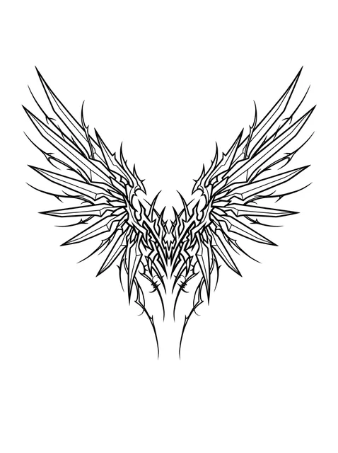
Black and white cybersigilism angel wings tattoo design Try it on — Black and white cybersigilism angel wings tattoo design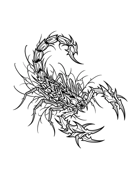
Black and grey cybersigilism scorpion tattoo design Try it on — Black and grey cybersigilism scorpion tattoo design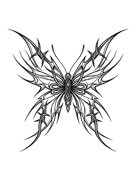
Black and grey cybersigilism butterfly tattoo design: a modern, edgy twist Try it on — Black and grey cybersigilism butterfly tattoo design: a modern, edgy twist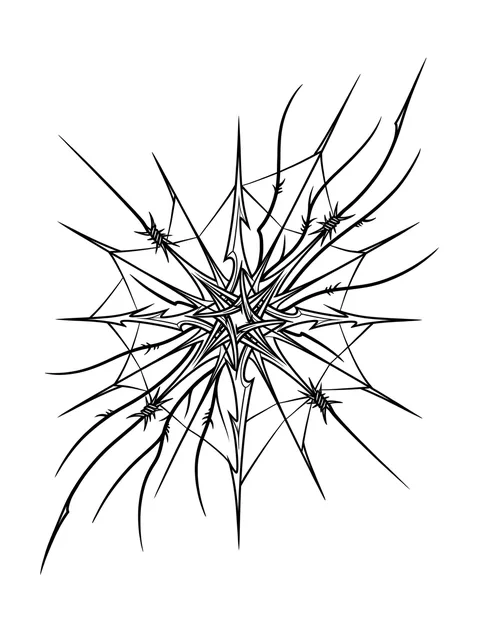
Black and grey cybersigilism abstract and web tattoo design Try it on — Black and grey cybersigilism abstract and web tattoo design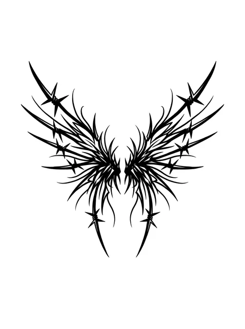
Black and grey cybersigilism angel wings tattoo design Try it on — Black and grey cybersigilism angel wings tattoo design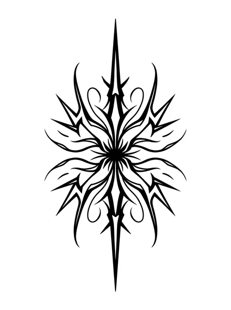
Black and grey cybersigilism abstract tattoo design Try it on — Black and grey cybersigilism abstract tattoo design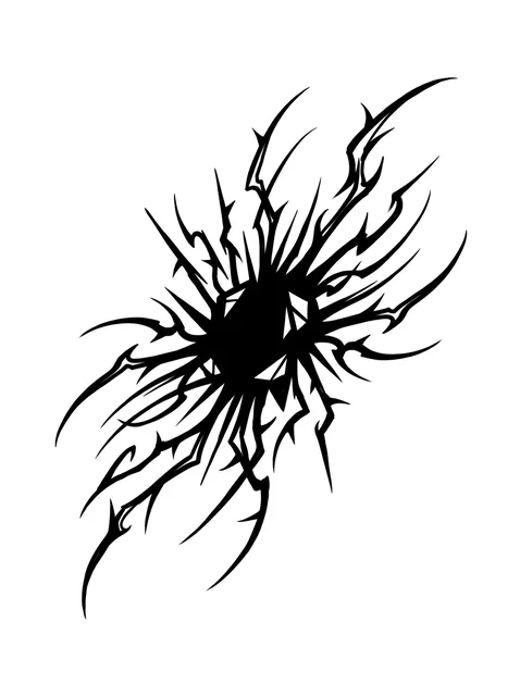
Black and grey cybersigilism abstract tattoo design Try it on — Black and grey cybersigilism abstract tattoo design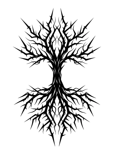
Black and grey cybersigilism tree tattoo design Try it on — Black and grey cybersigilism tree tattoo design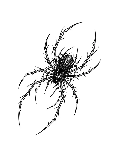
Black and grey cybersigilism spider tattoo design: a spider with long, spiky, thorn-like legs Try it on — Black and grey cybersigilism spider tattoo design: a spider with long, spiky, thorn-like legs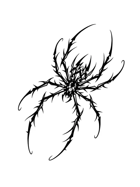
Black and grey cybersigilism spider tattoo design Try it on — Black and grey cybersigilism spider tattoo design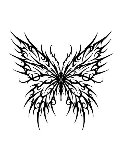
Black and grey cybersigilism butterfly tattoo design Try it on — Black and grey cybersigilism butterfly tattoo design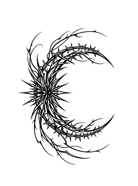
Black and grey cybersigilism moon tattoo design Try it on — Black and grey cybersigilism moon tattoo design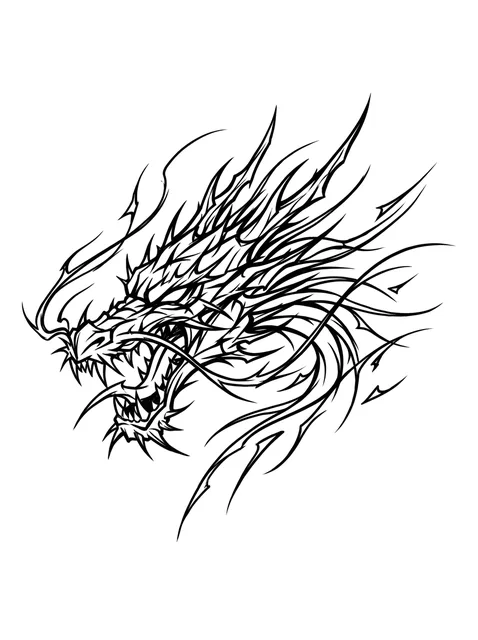
Black and grey cybersigilism dragon tattoo design Try it on — Black and grey cybersigilism dragon tattoo design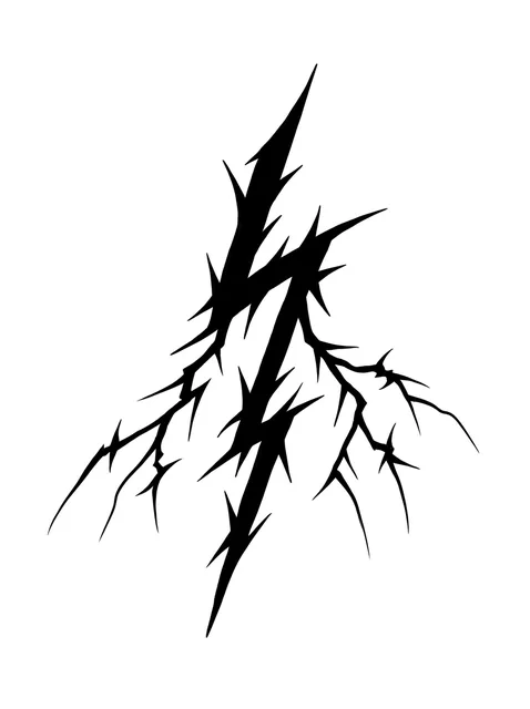
Black and grey cybersigilism lightning tattoo design Try it on — Black and grey cybersigilism lightning tattoo design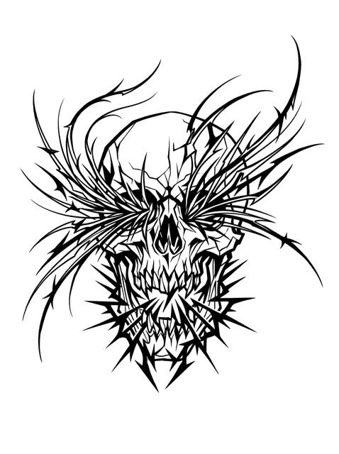
Black and grey cybersigilism skull tattoo design Try it on — Black and grey cybersigilism skull tattoo design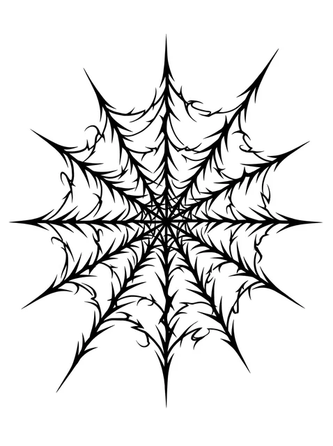
Black and grey cybersigilism web tattoo design Try it on — Black and grey cybersigilism web tattoo design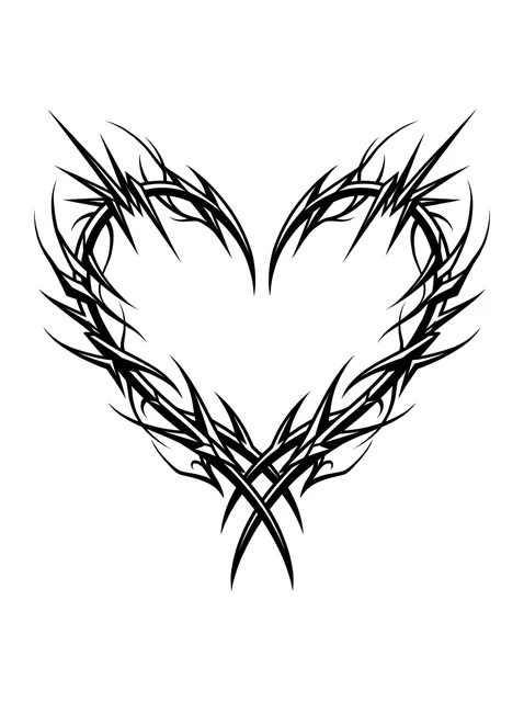
Black and grey cybersigilism heart tattoo design Try it on — Black and grey cybersigilism heart tattoo design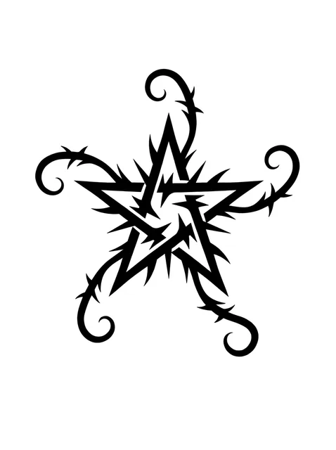
Black and grey cybersigilism star tattoo design Try it on — Black and grey cybersigilism star tattoo design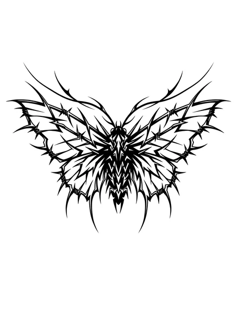
Black and grey cybersigilism moth tattoo design Try it on — Black and grey cybersigilism moth tattoo design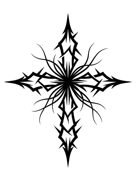
Black and grey cybersigilism cross tattoo design Try it on — Black and grey cybersigilism cross tattoo design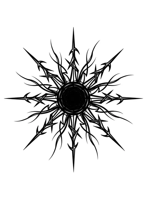
Black and grey cybersigilism sun tattoo design: a dense dark disc sends out rays Try it on — Black and grey cybersigilism sun tattoo design: a dense dark disc sends out rays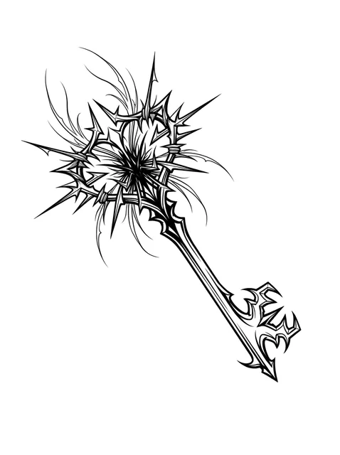
Black and grey cybersigilism key tattoo design Try it on — Black and grey cybersigilism key tattoo design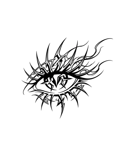
Black and grey cybersigilism eye tattoo design Try it on — Black and grey cybersigilism eye tattoo design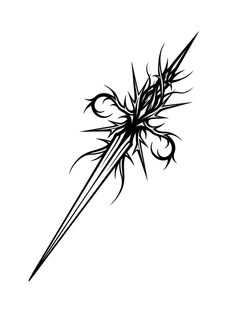
Black and grey cybersigilism dagger tattoo design: two barbed tendrils curling away from the grip Try it on — Black and grey cybersigilism dagger tattoo design: two barbed tendrils curling away from the grip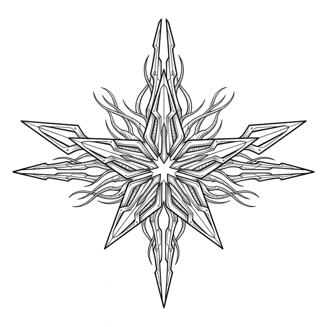
Black and grey cybersigilism star and abstract tattoo design Try it on — Black and grey cybersigilism star and abstract tattoo design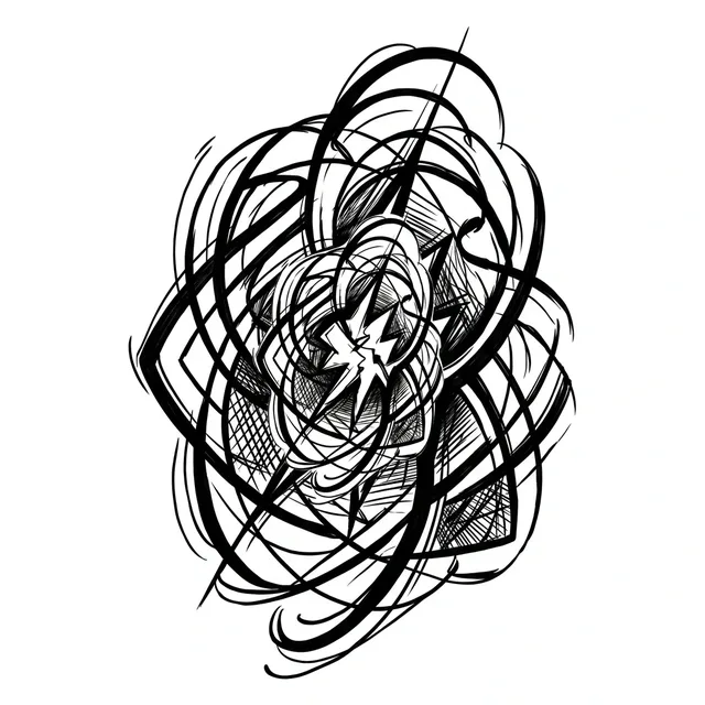
Black and grey cybersigilism abstract tattoo design Try it on — Black and grey cybersigilism abstract tattoo design


26 designs drawn for InkCraft in this style. Tap any one to place it on a photo of your own skin.
These 26 designs, in numbers
- Black and grey
- 26
- Colour
- 0
- Subjects covered
- 19
It is not tribal, and the difference is structural
The comparison is made constantly and it is wrong in a way worth understanding. Polynesian, Maori and Samoan work is built from repeating filled motifs, each with a name and a meaning, arranged to fit a specific part of a specific body — the pattern is a language. Cybersigilism has no vocabulary at all. It is a set of growth rules: a dense core, barbs radiating outward, tendrils thinning to almost nothing at the tips.
That structural difference shows up immediately in how a piece is composed. Tribal work fills an area and stops at a boundary; cybersigilism radiates from a point and fades out, so it has no natural edge. Drawn well, you cannot say precisely where it ends, and that is the whole effect.
It matters practically too. A tribal artist is working inside a tradition with rules about what may be worn by whom. Cybersigilism carries no such obligation, which is one reason it spread as fast as it did — it looks like heritage work and asks nothing of you.
The part nobody mentions: it is fragile
Every characteristic of the style works against longevity. The tendrils taper to nearly nothing, and a line that is nearly nothing at the appointment is nothing at all in ten years. The spikes rely on a crisp point, and points blunt first as ink spreads. And the negative space between elements is usually tight, because dense radiation is the look — so the gaps close.
That gives it a genuinely shorter life than almost any other style. A well-drawn traditional piece is legible at thirty years. A cybersigilism piece at thirty years is a grey mass unless it was drawn with far more space than looks right, which almost nobody asks for because it weakens the effect on the day.
The mitigation is the same one fine line needs and gets ignored just as often: go larger. The same design at 25 cm rather than 15 cm doubles every gap, and the gaps are the design. If it has to be small, ask for fewer elements rather than thinner ones.
Where it sits
It suits long fields that let a form radiate along a limb rather than being contained by it — the outer forearm, the calf, the spine, the outside of a thigh. A piece boxed into a square area loses the fade at the edges, which is the part that makes it look grown rather than stamped.
It is also the one contemporary style that genuinely benefits from wrapping. Because there is no correct orientation and no boundary, a design that disappears around the arm reads as continuing rather than as cropped — which is rarely true of anything with a subject in it.
Be careful about placing it beside existing work. The style has no outline and no containing shape, so it bleeds visually into whatever is next to it, and two pieces that each looked fine can turn into one confused area. Leave more space than you would between two bold designs.
What an hour of this work costs, and how many hours cybersigilism tattoos takes at each size, is in the cost guide. How it behaves later — under a laser, and as the thing doing the covering — is in the removal and cover-up guide.
Common questions
- Is cybersigilism the same as tribal?
- No, and the difference is structural rather than cosmetic. Tribal work is built from named repeating motifs arranged to fill an area and stop at a boundary. Cybersigilism has no vocabulary — it is a growth rule, radiating from a dense core and fading out with no edge at all.
- How long does a cybersigilism tattoo last?
- Less well than most styles, because everything that defines it is fragile. The tendrils taper to almost nothing, the spikes depend on sharp points, and the gaps between elements are deliberately tight. All three are the first things ink spread destroys. Going larger is the only real mitigation.
- Where did the style come from?
- Not from any tradition. It grew out of 1990s digital vector art and Y2K graphic design, and was revived on social media around 2021 — which makes it one of the newest recognised looks in tattooing and younger than most of the people wearing it.
- What size should it be?
- Larger than it looks like it needs. The negative space between the barbs is what makes the design read, and at 15 cm those gaps are already tight. At 25 cm they are twice as wide and the piece stays legible far longer. If it must be small, ask for fewer elements rather than finer ones.
See this style on your own skin
InkCraft places a design on a photo of you — scaled, wrapped and shaded to the spot you pick, so you can judge how the style reads on your body before it is permanent.